摘要
在Nobelium的Navbar适配手机端 添加折叠按钮和链接折叠组
碎碎念
话说貌似过多的页面在navbar的话 手机端貌似不会太好浏览 于是有了这次计划
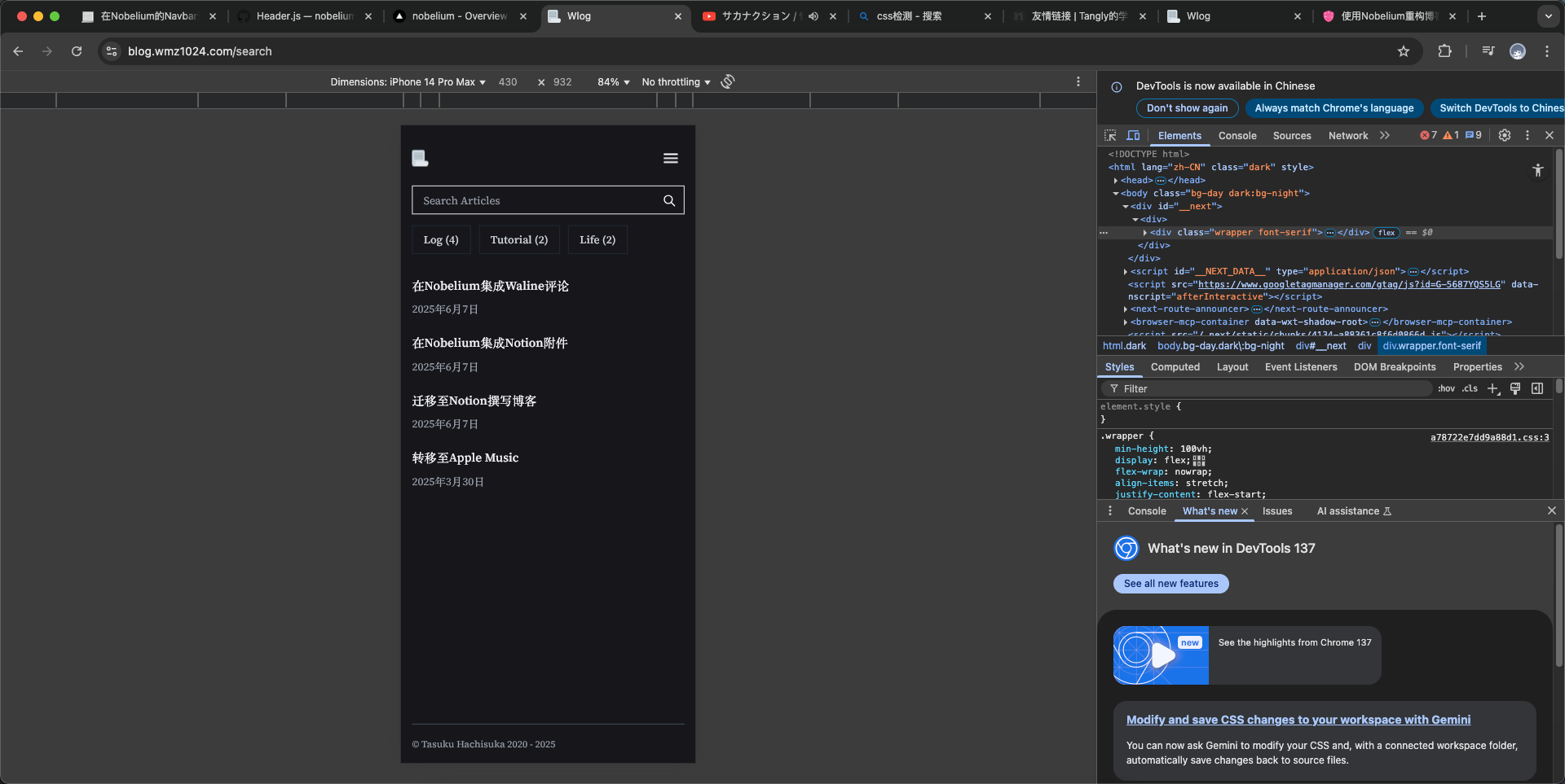
点击查看大图
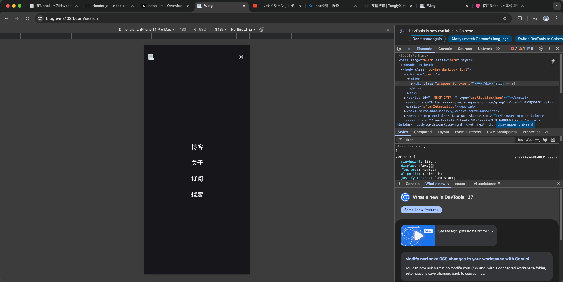
点击查看大图
比原来的看起来顺眼了一些!
教程
将原来的 components/Header.js 修改为
JSX
import { forwardRef, useCallback, useEffect, useRef, useState } from 'react'
import Link from 'next/link'
import Image from 'next/image'
import { useConfig } from '@/lib/config'
import { useLocale } from '@/lib/locale'
import useTheme from '@/lib/theme'

const NavBar = () => {
  const BLOG = useConfig()
  const locale = useLocale()
  const links = [
    { id: 0, name: locale.NAV.INDEX, to: BLOG.path || '/', show: true },
    { id: 1, name: locale.NAV.ABOUT, to: '/about', show: BLOG.showAbout },
    { id: 2, name: locale.NAV.RSS, to: '/feed', show: true, external: true },
    { id: 3, name: locale.NAV.SEARCH, to: '/search', show: true }
  ]
  return (
    <div className="flex-shrink-0">
      <ul className="flex flex-row">
        {links.map(
          link =>
            link.show && (
              <li
                key={link.id}
                className="block ml-4 text-black dark:text-gray-50 nav"
              >
                <Link href={link.to} target={link.external ? '_blank' : null}>{link.name}</Link>
              </li>
            )
        )}
      </ul>
    </div>
  )
}

export default function Header ({ navBarTitle, fullWidth }) {
  const BLOG = useConfig()
  const { dark } = useTheme()

  // Favicon

  const resolveFavicon = fallback => !fallback && dark ? '/favicon.png' : '/favicon.png'
  const [favicon, _setFavicon] = useState(resolveFavicon())
  const setFavicon = fallback => _setFavicon(resolveFavicon(fallback))

  useEffect(
    () => setFavicon(),
    // eslint-disable-next-line react-hooks/exhaustive-deps
    [dark]
  )

  const useSticky = !BLOG.autoCollapsedNavBar
  const navRef = useRef(/** @type {HTMLDivElement} */ undefined)
  const sentinelRef = useRef(/** @type {HTMLDivElement} */ undefined)
  const handler = useCallback(([entry]) => {
    if (useSticky && navRef.current) {
      navRef.current?.classList.toggle('sticky-nav-full', !entry.isIntersecting)
    } else {
      navRef.current?.classList.add('remove-sticky')
    }
  }, [useSticky])

  useEffect(() => {
    const sentinelEl = sentinelRef.current
    const observer = new window.IntersectionObserver(handler)
    observer.observe(sentinelEl)

    return () => {
      sentinelEl && observer.unobserve(sentinelEl)
    }
  }, [handler, sentinelRef])

  const titleRef = useRef(/** @type {HTMLParagraphElement} */ undefined)

  function handleClickHeader (/** @type {MouseEvent} */ ev) {
    if (![navRef.current, titleRef.current].includes(ev.target)) return

    window.scrollTo({
      top: 0,
      behavior: 'smooth'
    })
  }

  // 新增:移动端菜单控制
  const [isMobileMenuOpen, setMobileMenuOpen] = useState(false)
  const locale = useLocale()
  const links = [
    { id: 0, name: locale.NAV.INDEX, to: BLOG.path || '/', show: true },
    { id: 1, name: locale.NAV.ABOUT, to: '/about', show: BLOG.showAbout },
    { id: 2, name: locale.NAV.RSS, to: '/feed', show: true, external: true },
    { id: 3, name: locale.NAV.SEARCH, to: '/search', show: true }
  ]

  // 动态检测 html 的 class 是否包含 dark
  const [isDarkMode, setIsDarkMode] = useState(false)
  useEffect(() => {
    const checkDark = () => {
      setIsDarkMode(document.documentElement.classList.contains('dark'))
    }
    checkDark()
    const observer = new MutationObserver(checkDark)
    observer.observe(document.documentElement, { attributes: true, attributeFilter: ['class'] })
    return () => observer.disconnect()
  }, [])

  return (
    <>
      <div className="observer-element h-4 md:h-12" ref={sentinelRef}></div>
      <div
        className={`sticky-nav group m-auto w-full h-6 flex flex-row justify-between items-center mb-2 md:mb-12 py-8 bg-opacity-60 ${
          !fullWidth ? 'max-w-3xl px-4' : 'px-4 md:px-24'
        }`}
        id="sticky-nav"
        ref={navRef}
        onClick={handleClickHeader}
      >
        {/* 移动端左侧logo+右侧汉堡按钮,桌面端不显示 */}
        <div className="flex items-center w-full justify-between md:hidden">
          <Link href="/" aria-label={BLOG.title} className="block">
            <Image
              src={favicon}
              width={24}
              height={24}
              alt={BLOG.title}
              onError={() => setFavicon(true)}
            />
          </Link>
          <div className="flex items-center ml-2">
            <HeaderName
              ref={titleRef}
              siteTitle={BLOG.title}
              siteDescription={BLOG.description}
              postTitle={navBarTitle}
              onClick={handleClickHeader}
            />
          </div>
          <button
            className="flex items-center justify-center w-10 h-10 z-30 relative ml-auto"
            aria-label="Open Menu"
            onClick={e => {
              e.stopPropagation()
              setMobileMenuOpen(true)
            }}
          >
            <svg width="28" height="28" fill="none" viewBox="0 0 24 24">
              <path stroke={isDarkMode ? '#fff' : '#000'} strokeWidth="2" strokeLinecap="round" d="M4 7h16M4 12h16M4 17h16" />
            </svg>
          </button>
        </div>
        {/* 桌面端logo+标题+导航 */}
        <svg
          viewBox="0 0 24 24"
          className="caret w-6 h-6 absolute inset-x-0 bottom-0 mx-auto pointer-events-none opacity-30 group-hover:opacity-100 transition duration-100 md:block hidden"
        >
          <path
            d="M12 10.828l-4.95 4.95-1.414-1.414L12 8l6.364 6.364-1.414 1.414z"
            className="fill-black dark:fill-white"
          />
        </svg>
        <div className="hidden md:flex items-center">
          <Link href="/" aria-label={BLOG.title}>
            <Image
              src={favicon}
              width={24}
              height={24}
              alt={BLOG.title}
              onError={() => setFavicon(true)}
            />
          </Link>
          <HeaderName
            ref={titleRef}
            siteTitle={BLOG.title}
            siteDescription={BLOG.description}
            postTitle={navBarTitle}
            onClick={handleClickHeader}
          />
        </div>
        {/* 桌面端导航 */}
        <div className="hidden md:block">
          <NavBar />
        </div>
      </div>
      {/* 移动端全屏菜单 */}
      {isMobileMenuOpen && (
        <div className="fixed inset-0 z-40 flex flex-col bg-day dark:bg-night bg-opacity-95 transition-all duration-300" style={{ minHeight: '100dvh',paddingTop:'1rem' }}>
          <div className="sticky-nav group m-auto w-full h-6 flex flex-row justify-between items-center mb-2 md:mb-12 py-8 bg-opacity-60 max-w-3xl px-4">
            <Link href="/" aria-label={BLOG.title} onClick={() => setMobileMenuOpen(false)}>
              <Image src="/favicon.png" width={24} height={24} alt="logo" />
            </Link>
            <button
              className="flex items-center justify-center w-10 h-10"
              aria-label="Close Menu"
              onClick={() => setMobileMenuOpen(false)}
            >
              <svg width="28" height="28" fill="none" viewBox="0 0 24 24">
                <path stroke={isDarkMode ? '#fff' : '#000'} strokeWidth="2" strokeLinecap="round" d="M6 6l12 12M6 18L18 6" />
              </svg>
            </button>
          </div>
          <nav className="flex-1 flex flex-col items-center justify-center space-y-8">
            {links.filter(link => link.show).map(link => (
              <Link
                key={link.id}
                href={link.to}
                target={link.external ? '_blank' : undefined}
                className="text-2xl font-semibold text-black dark:text-gray-50 hover:text-blue-500 dark:hover:text-blue-400 transition"
                onClick={() => setMobileMenuOpen(false)}
              >
                {link.name}
              </Link>
            ))}
          </nav>
        </div>
      )}
    </>
  )
}

const HeaderName = forwardRef(function HeaderName ({ siteTitle, siteDescription, postTitle, onClick }, ref) {
  return (
    <p
      ref={ref}
      className="header-name ml-2 font-medium text-gray-600 dark:text-gray-300 capture-pointer-events grid-rows-1 grid-cols-1 items-center"
      onClick={onClick}
    >
      {postTitle && <span className="post-title row-start-1 col-start-1">{postTitle}</span>}
      <span className="row-start-1 col-start-1">
        <span className="site-title">{siteTitle}</span>
        <span className="site-description font-normal">, {siteDescription}</span>
      </span>
    </p>
  )
})
⚠️ 我之前修改过默认favicon的地址 请你注意(未引用默认config的配置哦!)
///相关阅读